 I used to think the Pantone colour trend reports were a bit of fun, some light colour-based entertainment a couple of times a year that had no particular impact on my life. However, since following the Pantone colour reports I’ve really begun to notice the way they reflect what’s available in the shops, both in terms of clothes and interiors. So if you’ve been skipping over my colour reports up until now, this is the moment to sit down, grab a cup of tea and get reading, because these colours will influence what you can actually get hold of in shops over the coming months.
This is a good A/W to belong to one of the muted seasons (Summer and Autumn), although Springs and Winters need not panic as there are a few gorgeously vibrant shades out there. And, of course, Kettlewell has your version of each of these shades available, so even if the high street lets you down the 150+ shades available at Kettlewell won’t.
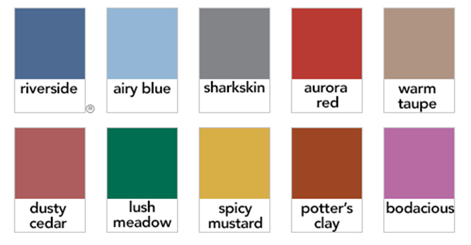
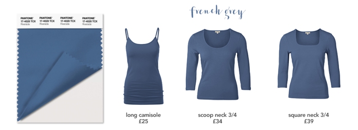
Riverside
The first of this autumn’s two blues, Riverside is a perfect denim blue shade. As well as tried and true denim, expect to see it in luxurious textures such as velvet and corduroy. Having said that this was a good season to be an Autumn, this one really isn’t a shade for the warm and muted among us; it is very much a Summer colour, although I’m sure that brighter versions will abound for Springs and Winters.
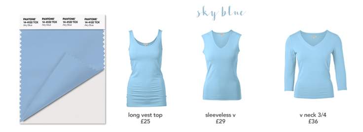
Airy blue
Airy blue, as the name implies, is a gentle sky blue shade. And, ahem, another one that isn’t going to be great on the Autumns (your time is coming, I promise!). This is a true Summer shade which will pair brilliantly with deep burgundies and greys, and brighter versions will work for Springs.
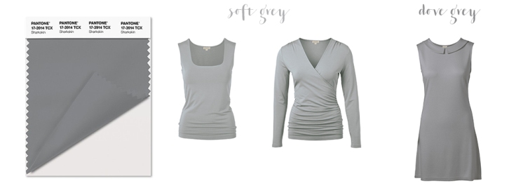
Sharkskin
Almost a shade for every season! Sharkskin is a great neutral grey that will work as a backdrop for a rainbow of colours. Best on Winters, variations on the theme will work on all four seasons.
Aurora Red
More or less a true red, Aurora red is bright, punchy and bold. Expect to see it on lips, clothes and interiors. Although the actual Pantone shade is more of a Spring/Autumn warm toned one, the shade is so warm as to be virtually neutral and I’m sure that versions will abound for every season.

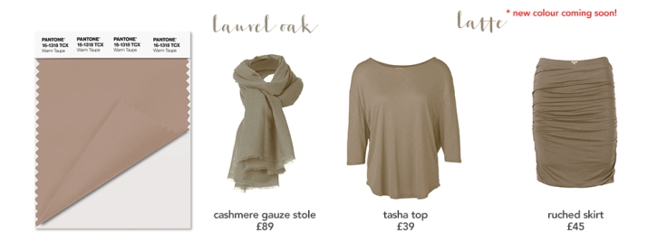
Warm taupe
Now, if there’s a word I probably wouldn’t use to describe warm taupe, it’s ‘warm’. Yes, it is technically warm toned, but it’s hardly a golden yellow shade, is it? This shade is 100% Autumn, but grey and rose tinted versions may appear that will make it appropriate for Winters and Summers respectively. Springs are never going to rock this kind of dull taupe shade, stick to beige if you want a neutral that works similarly.
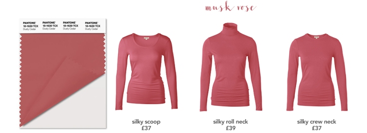
Dusty cedar
Dusty cedar falls somewhere on that tricky dividing line between Summer and Autumn, so expect to see versions for both seasons. A little more mauvey and it’s the perfect Summer shade, but add a touch of salmon pink to the undertone and it’s a soft Autumn shade. Springs and Winters need not apply.
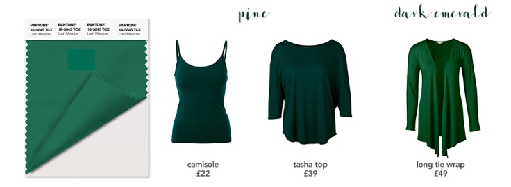
Lush meadow
The name might lead you to think that this shade might be, ooh, grassy. But no. This is in fact a deep emerald green, the kind of Autumn/Winter palette crossover colour that I’d usually expect to see at this time of year. Rich and luxurious, it will be probably found in the velvet, brocade and military trends that will be seen everywhere this season.
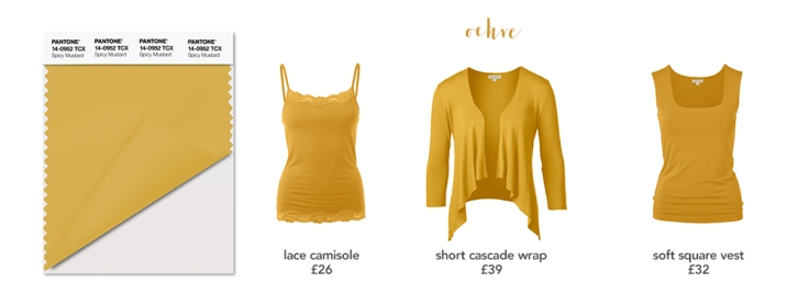
Spicy mustard
Autumn all the way, this one. Spicy mustard really doesn’t fall into any other palette, but its rich golden tones are perfect for Autumns. Expect to see versions from yellow ochre, which might work on some Springs all the way through to deepest browned gold.
Potter’s clay
Warm toned and rusty, potters clay is another Autumn shade, but fractionally brighter and it becomes Spring’s terracotta. There isn’t ever going to be a version of this that doesn’t make Summers and Winters look awful, so stay away if you’re cool toned.

Bodacious
As Pantone themselves say, this isn’t an obvious A/W colour, but this sophisticated pinky purple hue will work brilliantly on Summers, who normally get slightly short shrift in A/W. Between Bodacious and the two blues, riverside and airy blue, it’s looking like a good winter to be a Summer!


Post a comment